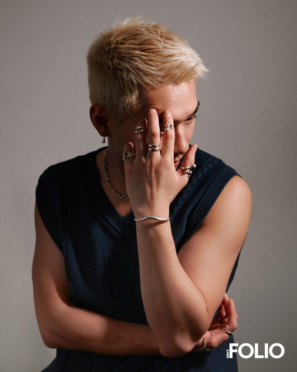
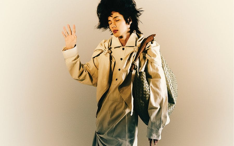
 Rong Jake Chen opens up on what it means to be a person-of-colour designing in a white-dominated market and the inspirations and master plan behind the growing popularity of his genderless jewellery label Graedance.
Rong Jake Chen’s designs seem to exist in the abstract plains of ideas, yet the Chinese-born Australian designer is grounded in pragmatic beliefs. In an industry that thrives in the perils of constant revamps and overhauls in search of the next “big” thing, the path for creatives is often laden with risks — grow too slowly, and it becomes a reckless gamble; grow too quickly, and insufficient demand might leave your dream half-baked — but the creative behind the genderless jewellery label Graedance had different challenges growing up. “Being an immigrant, I was never really exposed to the possibility of working in the arts or creative industries,” shares Chen. “Both my grandfathers were teachers, and they instilled the idea that practical education was above all else.”
I’ve read that you never had a formal education in fashion. Can you tell us more about what changed your mind and how you found yourself in the industry?
Being an immigrant, I was never really exposed to the possibility of working in the arts or creative industries. Both my grandfathers were teachers, and they instilled the idea that practical education was above all else. However, growing up, I always loved to draw in class and got lost in fictional landscapes whenever I could. I never thought twice about pursuing anything creative-related — not because I didn’t want to — but becauseI honestly had no framework or reference of people who engaged in these practices. When I did a study abroad in Paris, I met people who were different to those I grew up with, and it excited me. This took me aback, and being a huge believer in continuous learning — I took this on board to teach myself through experience and exposure as much as I could about the fashion industry. As frivolous and impractical fashion can be seen— being a practical person — I knew that pursuing a challenging path of passion was well more worth it than anything else.
What have you learnt from your formal education that has influenced how you approach fashion? Was venturing into jewellery-making something you have always thought about?
Having studied business, I found myself “unlearning” a lot when approaching fashion — fashion isn’t something we consume out of necessity but from emotions, which is rarely referenced in those case studies we studied back at school. This was the primary reason I found myself in jewellery making; I wanted to create and share pieces that would beheld as future sentiment, that could hold stories within themselves. To create pieces that become catalysts for memory, for those I design for, people who felt their stories weren’t well told through culture’s blueprint.
Graedance reflects a sense of duality and fluidity — almost like an aura or mantra for the brand — it is also reflected on the website through a statement that describes Graedance’s aim as “to allow for the discovery of each individual’s ‘in-between’ and grey area”. What barriers are you trying to remove when it comes to jewellery-making?
Similar to when designing menswear, I always approach creating things with a perspective of design versatility — which means I create objects that could be perceived or worn differently by different individuals. I’ve been told this design-first approach offends many traditional jewellers because I circumvent traditional rules when it comes to creating “jewellery”. And this is exactly what I want to be doing because what I want to translate across is that rules sometimes can be so arbitrary, and we follow them for no considered reason at all. You’re right. Fluidity and movement are going to be everlasting associations with the brand. “Dance” was chosen as part of the name for this reason — for its varied motion and emotion and ever-evolving nature and importance. Something I hope this project can follow.
Could you tell us more about this grey area?
The grey area I refer to — the one that is also ingrained into the brand’s name (“Grae”)— references the beauty of grey, a colour often relegated to one shade but, in reality, is a large spectrum of tones between black and white. These beautiful gradients are how I see our experiences — often relegated to one journey but, in reality, so distinct and vast. Graedance is about celebrating our distinctiveness and place within our communities and challenging binaries set upon us — embracing the in-between of the black and white offered to us.
 I’ve noticed similarities between your previous endeavours — where utility seems to be an emphasis — but Graedance reflects themes of superstition and mythology. Could you expand on that?
I tend to look at my past and present in creating my work. The first collection for Graedance entitled “Sacred / Slow” — inspired by dances of the same names — drew a lot on the stories of myths and legends that shaped my Sunday afternoons in the library. I wanted to contrast this everlasting connection with my current obsession with technology — think AI, 3D, XR — so the collection referenced the grey area between“nature” and “construction”, between digital and physical realms.In line with this, I found myself to be more and more spiritual as time goes by — leaning into superstition — and I feel it adds a sense of calm and wonder to my journey. But you notice that I speak about superstition with a sense of utility towards my life — I guess that’s something I can’t avoid as a person and in my designs.
How has your experience with AMXANDER influenced your approach to Graedance?
AMXANDER’s design ethos was primarily a study of uniforms, objects that draw from strong cultural references and perspectives. Since doing that for years, I wanted to focus less on the object and the wearer in my work. It was creating pieces that enhanced and extended the wearer’s individuality and own story. Being the materials lead at AMXANDER, I’ve placed this obsession into Graedance, where I study and look into the limited (relative to fabrics) selection of mediums I can use in my work. A small look into this would be using silver with a composition closer to 93%, slightly higher than that of sterling silver (92.5%), to enhance the natural shine and softness of the designs to achieve visual distinction. The designs are also slightly malleable and adaptable to our changing bodies, a core feature in our most well-received category — our rings.
Do you ever face the pressures of accommodating the majority of consumers? How do you overcome that?
At the end of the day, I’m simply conscious I don’t design for the majority of consumers. I design for what we call our “dancers”, our people who challenge cultural binaries and whose paths aren’t most commonly seen. They are extraordinary people, so they need extraordinary designs.
Were there any hurdles you had to endure before getting to where you are today?
Enduring a lot of feelings is not uncommon for creatives — a lot of personal inner demons questioning my own work definitely has held me up or slowed me down on more than one occasion. However, I’ve learnt that people are really just faking it until they make it — confidence is an illusion. So for those reading at home — be delusional and have the confidence you would imagine yourself having in the future; it really works.
Does being Asian throw a spanner in the works? Did you face or are you facing difficulties getting to your goal simply because of your race?
Without getting too much into racial politics — when you’re not the dominant culture, it’s hard to continually overlook certain scenarios and results without questioning whether race was involved. As mentioned, I’m long past the disappointment in my own identity but am onto the celebration of it. Nevertheless, I am optimistic about the direction our society is heading regarding how we see binaries like race, gender and sexuality.
Photography Jaya Khidir
Interview Manfred Lu
This interview was first published in our May 2023 issue. Catch up with it here.


