View this post on Instagram
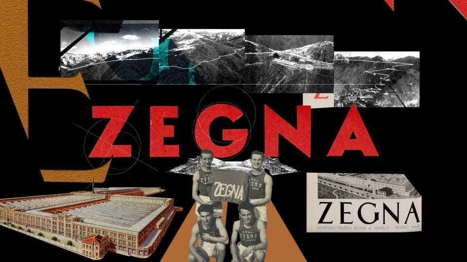
At risk of sounding like hardcore design aficionados, Zegna’s new logo is beautiful and not just because it isn’t a cookie-cutter sans serif font and neither because it’s tight kerning (that our friends, is the space between each character) looks quite pleasing.
It is simply because it reflects the entire genesis of the house since it was founded 110 years ago: stately without being overtly serious, intellectual without the pretension and most importantly, handsome and strong. The latter, a trait that has seen itself through several designers over the years.

In equilibirum: Zegna’s logo over the years before the House brought it into the now.

One might even say that the slightly forwardness of Zegna’s new logo signifies forward movement — physically, the ends do point downwards and metaphorically, the brand is constantly changing the status quo on manhood — the answer would be that he’s quite right. After all, the release has mentioned for us to “be catalysts for change and champions of a brighter future together. It is a path worth taking.”. And that, is the right attitude for 2022.
Once you’re done with this story, click here to catch up with our November 2021 issue.


