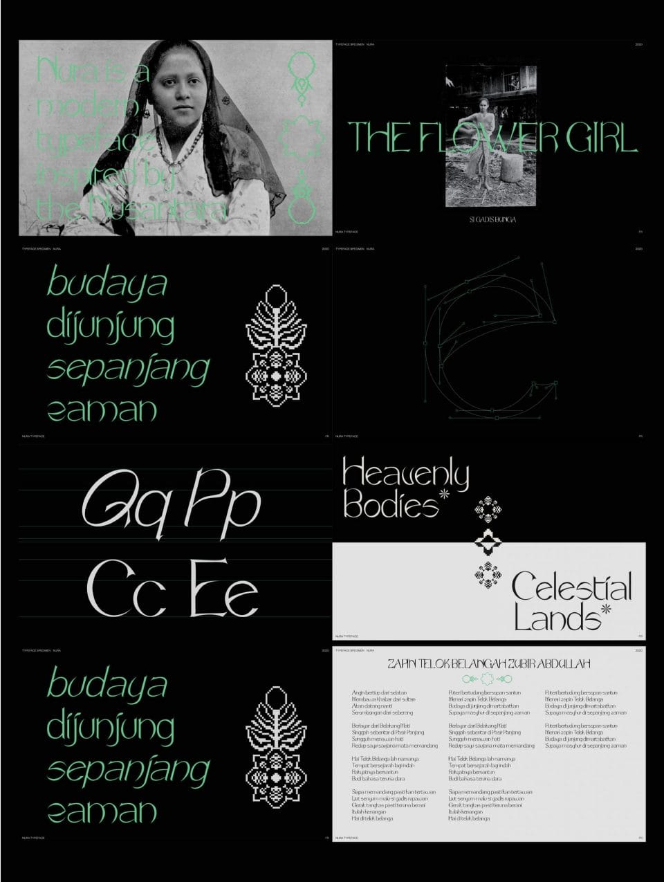
Aspiring type designer Fatih Rosli talks us through his views on typography and the NURA Typeface created from scratch.
Before we begin, give an introduction about yourself.
I’m Fatih Rosli, and I’m a graphic designer and aspiring type designer currently enrolled in a BA (Hons) degree at LASALLE College of the Arts. If I’m not creating, I’m binge-viewing Netflix episodes or watching culinary videos on YouTube, as corny as that may seem.
Amongst the works you’ve been involved in, we noticed the majority of them are typography design. What drew you to this aspect of design?
Languages and linguistics spark my attention and intrigue. Language, I feel, is the thread that ties us all together. I view typography as designing how languages appear, and I think it’s fascinating that the laws of typography seem so structured and yet people can come up with a thousand different methods for achieving what they want.
Please share your thought processes when you are starting on a new typography design project.
When I begin a personal project, it is generally out of interest. I do it because I want to and because I can. I just want to enjoy the process, and by doing so, I’m able to refine my talents and highlight my faults and strengths. When I embark on such projects, my major goal is to exercise my talents and see where I stand and where I can grow.
The NURA Typeface, derived from Jawi scripts, is one of your standout creations. Is there a personal connection you share with it?
Because of the Islamisation of Maritime Southeast Asia, the Arabic script greatly influenced Jawi. I am intimately acquainted with that as a Malay Muslim. When I was younger, learning Jawi was a part of the curriculum in my weekly religious and Quranic classes. So, certainly, it does evoke feelings of nostalgia in me.
What are some challenges you faced when designing the NURA Typeface?
Because NURA was my first time designing a typeface from scratch, I ran across a slew of challenges. Initially, I was sketching up a design and settling on a typographic scheme, doing my best to ensure that each letter is consistent as a whole. The thing about type is that there are so many different ways to style. However, much as in graphic design, there are methods and guidelines in place to ensure that a typeface is legible, balanced and appealing.
The challenge is to find ways to work around those rules to acquire what you desire. Then there was the issue of digitising them. I was like a deer in the headlights because it was my first time using Glyphs as a font creating program. I had to go through several file revisions to become used to it and learn how the program interface worked.
Because I was still completing National Service at the time, it became a major learning curve for me while I was creating.
Are you able to share an interesting piece of trivia you chanced upon while researching for the NURA Typeface?
NURA’s acute points, tiny curves, and sharp edges were inspired by looking at roofs across Nusantara architecture, particularly Minangkabau roof designs, which are well-known for their distinctive structure. Each part of the home, also known as Rumah Gadang, signifies something.
The hornlike roofs, gonjong, represent reaching out to God and the heavens, while the walls of the side elevations, dindiang tapi, reflect the strength and usefulness of the community.
Do you feel that typefaces inspired by historic scripts hold cultural significance in the current times we live in?
Yes, I suppose so, especially if typefaces are made exclusively to recreate that particular old script. NURA is a Latin font, but someone out there could create a Jawi script font or an old Southeast Asian typeface, which I feel would have a far greater influence in today’s world. Historic scripts, in my opinion, should be treated as cultural artefacts. Everyone likes artefacts; we see them in museums all the time.
In typography, we should have the same regard for these ancient scripts. People need to put forth a lot more effort to grasp history and where we come from, and language and scripts are a fantastic place to start.
Are there topics or meanings you hope to address, convey or dispel with typography design?
I feel that design, in general, is an effective tool for politics and social problems and that designers must acknowledge their power as designers. That being said, as much as I want to make my designs meaningful, I also recognise that design does not have to be political or serious. If approached in this manner, design can be a lot of fun. Design is a vital tool, but it is also an art form. We don’t have to take them seriously all the time, in my opinion. Simply said, do anything you want because you can.
Are there any interesting projects you are currently working on?
Now and then, loose ideas form in the back of my head. Some ideas have a lot of promise which explains why I have hundreds of incomplete work files on my computer. As of now, I have no itching project ideas in the back of my mind that need to be realised. But I’ll be ready to begin whenever inspiration hits.
Images Courtesy of Fatih Rosli
Once you’re done with this story about Fatih Rosli, click here to catch up with our November 2021 issue!


