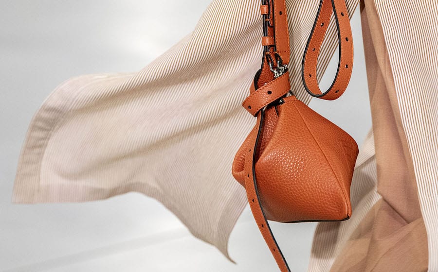
Loewe has a new identity. Shedding its staid image, the Spanish house has done away with its brown-hued packaging in favour of more contemporary, off white ones that resemble library tomes. The iconic anagram has also undergone a makeover, with the interlocking L’s now separated and in a different typefont.
The rebranding marks the next chapter of Loewe under new Creative Director Jonathan Anderson.
The Spring Summer 2015 ad campaign, conceptualised by Anderson in collaboration with French design house M/M Paris, combines the past (vintage images from Vogue Italia and products from Loewe’s archives) and the present (new designs by Anderson) in a poetic marriage that symbolises what the future holds for the revered Spanish label.


Below: LOEWE Creative Director Jonathan Anderson
RELATED ARTICLES
Givenchy's Hard Carry Is the Voyou

Polo Ralph Lauren Gets Custom Made By Naiomi Glasses