 ‘
‘
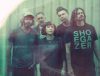
The film follows Job Wouters, whose eye-popping typographic designs are created live and entirely by hand, as he completes 80 drawings in a single sitting – one for each year of Canali’s existence.
In a sharp, stylised setting, slow-panning shots reveal flashes of De Stijl-like colour capturing the gestural beauty of Wouters’ brushstrokes and the increasing intricacy of his images. It’s a tribute to the timeless quality of the handmade, echoed in the hand-tailored Canali clothing that Wouters wears as he works.
In an additional interview video, the first in Canali’s new “200 Steps” content series, Wouters explains the process behind his meticulous typographic work, which has been exhibited at institutes including the Walker Art Center, Minneapolis and the Design Museum, Helsinki. In 2014 Wouters will be joined by a series of international creatives on Canali.com, as the series continues to ask great men to share the thoughts and method behind their work.
The new Canali.com offers a fresh online presence for the Italian brand, which has been dedicated to creating peerless men’s clothing since 1934. Combining a crisp, minimal and thoroughly contemporary aesthetic with a wealth of intriguing content, the site covers everything from Canali’s heritage and services to essential tips that no man of style should be without.

A key feature of the new site is L’Edizione, a regularly updated online journal that explores the season’s trends and styles via lifestyle features, practical styling tips and the “200 Steps” series. In addition, the site offers detailed information on Canali’s Su Misura made-to-measure service and allows users to book an appointment at their nearest store.
Built on a responsive design framework, Canali.com is one of the first luxury menswear brand sites built to provide an optimal viewing experience, with easy reading and navigation across a wide range of devices from desktop monitors to tablet and mobile. Being responsive, the site adapts the layout to the viewing environment by using fluid grids and flexible images to resize the pages while maintaining the correct proportions of the site.
RELATED ARTICLES
Life, In A Slow Dive
